Visitor sheets for Network Meetings
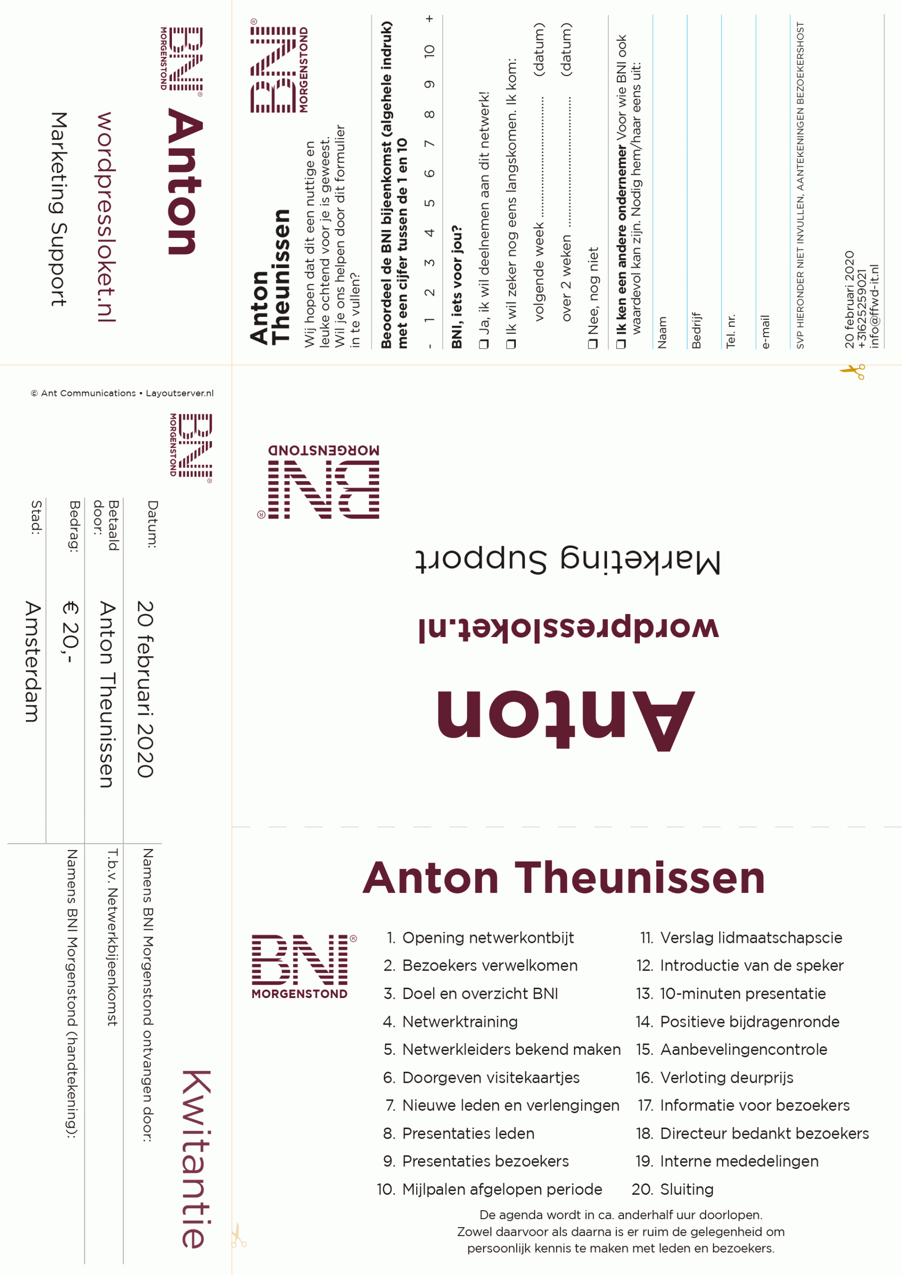
Especially for BNI we developed ‘visitor Kits’. available in A4 and Letter formats, just like the ‘placemats’ or ‘meeting note sheets’.
Each visitor sheet has five sections:
- Visitor badge
- Payment receipt
- Feedback form
- Table card (tent card), facing the visitor
- Table card (tent card), representing the visitor
How to get the most of these items is described on our Mission page.
This article is about the Table Card, especially the ‘reverse side’, facing the visitor.
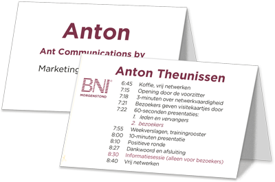
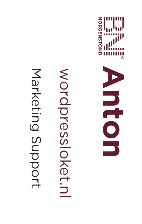

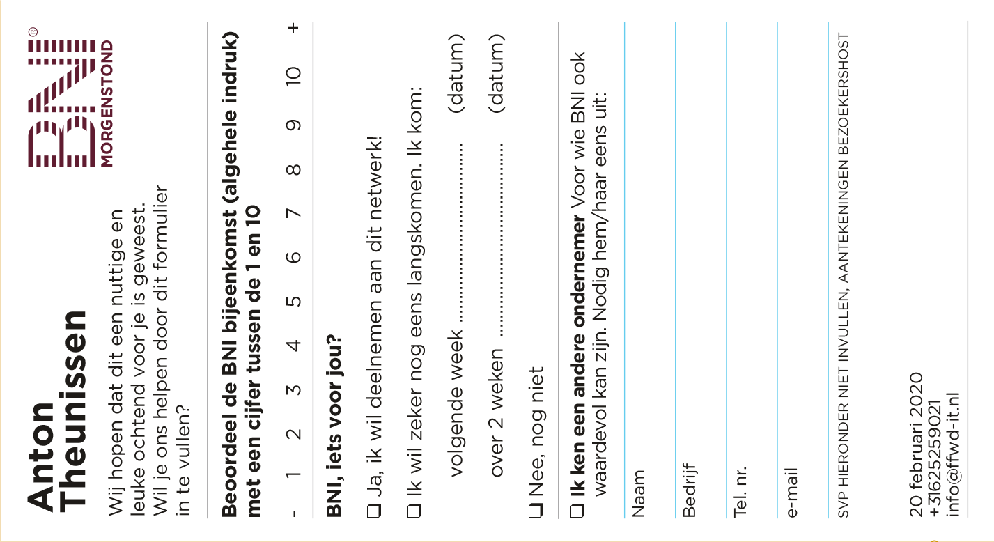
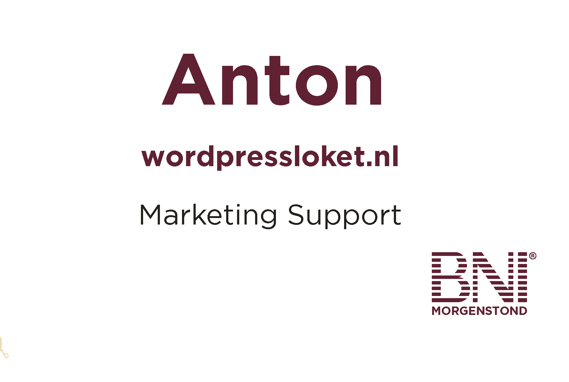
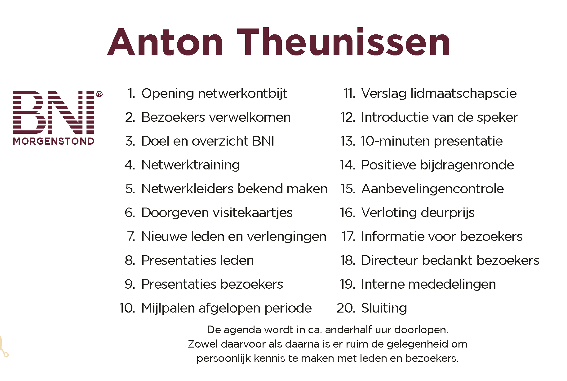
This reverse side has five different options to display, selectable in your user profile. Each option has it’s own purpose. It is the information that is constantly in sight of the visitor, so it’s paramount to consider what should be communicated here. What helpful information can we show that overwhelmed person?
I’ll quickly run through the possibilities and considerations.
First of all: his/her name. It’s on each option, so visitors can easily find their seats. They’ll see that their visit is professionally prepared. With the help of that card, they can also be seated strategically, next to potential future Powerteamers or other persons of interest.
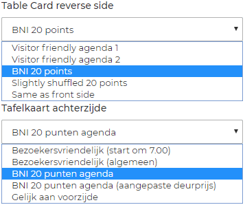
The different reverse sides
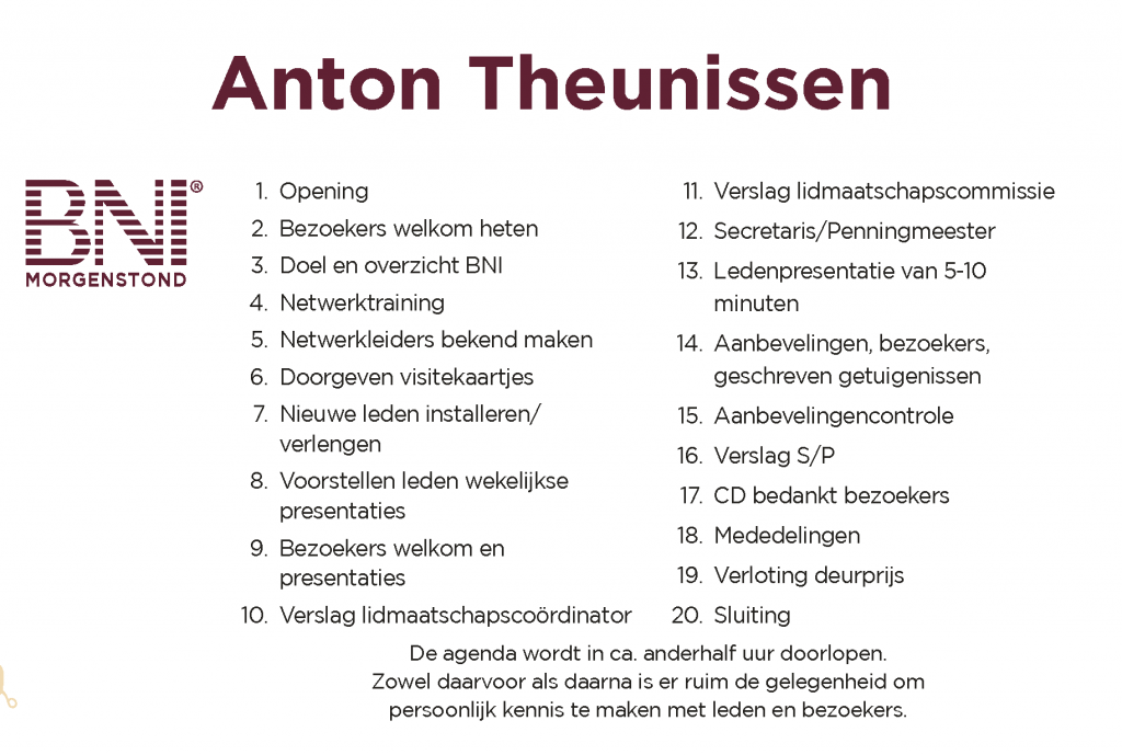
20 points agenda
BNI officials are convinced that we should communicate the instructions as developed for the leadership team. They consist of a 20 points scenario, which is in BNI handbooks, guides and trainings so that no points will be skipped or forgotten. That’s the BNI roll and, according to some, that’s why that’s the best thing to communicate.
So: choose this 20 points Agenda and you’re fine.
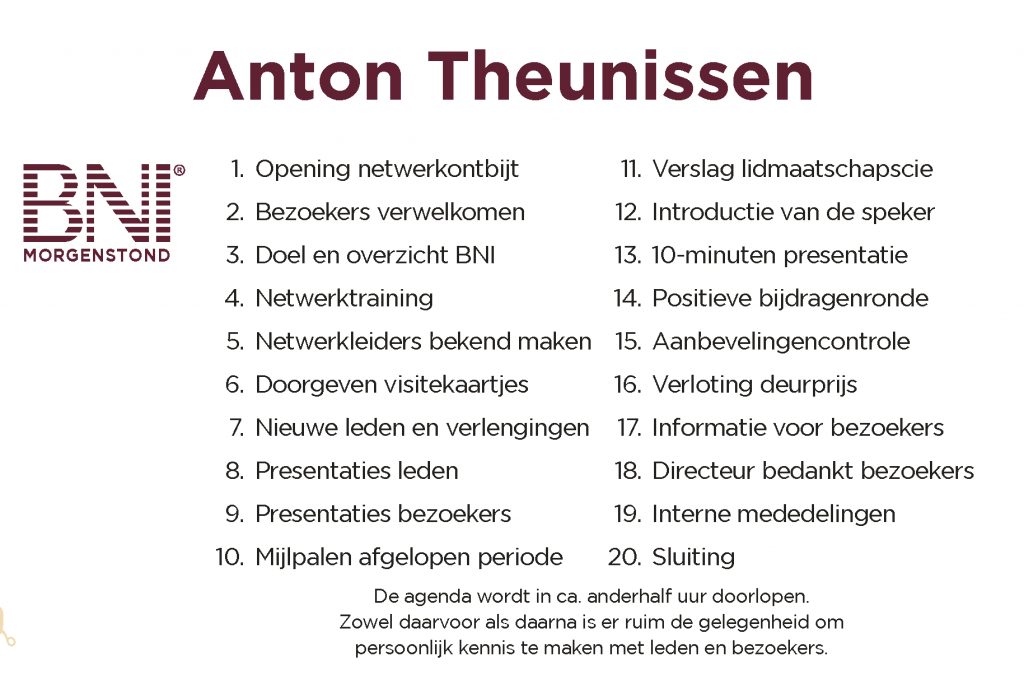
20 points agenda, draw gift before excusing the visitors
Then why a second 20-point agenda? Well, that’s because even BNI officials can differ on minor points. Some prefer to stick to the ‘BNI agenda’, no matter what. Others allow themselves some freedom – if the chapter performance allows it. (if not: go back to the official agenda!)
In the original agenda, the Draw Gift is planned AFTER the visitors have left the room. Some think that’s a missed opportunity because it’s a fun point and it would help the positive vibe of the meeting if the visitors witness the draw. Agree? You can choose this (non-official) BNI 20 -points agenda. (I also removed some overly descriptive details.)
Most chapters start at 7AM. For chapters with different starting times, the times are replaces with duration indicators.
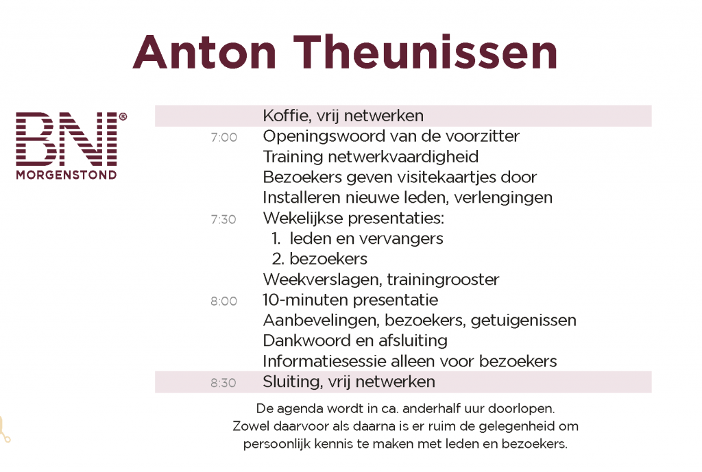
Visitor friendly version
starting at 7AM (3) or with just duration indication (4)
There’s also another angle. Should we confront a first time visitor with directions that are meant for the leadership team? Is it really so important to let a visitor know that point 12 is the announcement of point 13? For the leadership team it’s a meaningful instruction, but for the visitor? I think not. It’s distracting, confusing and irrelevant for the visitor. If it isn’t helpful: skip it.
[This is the most common mistake that I have seen clients make in their communication efforts: they always try to tell about what they did, what they have and how they came to do what they do. Some even only talk about their tools, production methods or strategy. The same is happening here: an internal cook book is presented, while it’s the flow of the meeting, the experience, that should be supported.]
So I also created a condensed ‘visitor friendly’ version of the agenda. There are no unknown terms, no ‘who does what’: just some orientation points and an indication of the time that the meeting will take. We offer the outlines, they can fill in their own details (‘what’s in it for me’) when experiencing the meeting.
Some points aren’t mentioned, the Draw Prize for example. The visitor has no clue what it is in the first place, it has to be explained anyway, before starting the presentations. I consider it as playful element of the “Feature Presentation”. Or point 12: “Treasurer announces point 13”. It serves no purposes – except instructional for the leadershipt team.
Reverse side: same as Front
On special meetings, the agenda doesn’t apply. Theme days, visitor days, orientation meetings and so on, all can have different agendas. In that case there’s the option to display the same information on both sides of the tent card so all participants can find their own reserved seats.

Conclusion
Any educated marketing or communications professional will acknowledge that the 20-point agenda is a very important tool for network meetings. At the same time, repeating internal strategies and protocols are not by definition the best way to raise conversion.
The BNI 20 points agenda is an element of the proven and well thought-out BNI format. Either show these 20 points literally to the visitor or select the condensed visitor-friendly version to display on the table card. Up to you to decide. In case of doubt, choose the 20 points agenda or follow the advice of your chapter consultant or area director.

